
FRESHEN UP WITH PANTONE’S NEW COLOR CHOICES FOR SPRING
Pantone has a fresh new color palette for spring 2015.
These colors are meant to work together to brighten and enhance your space for the up coming season.
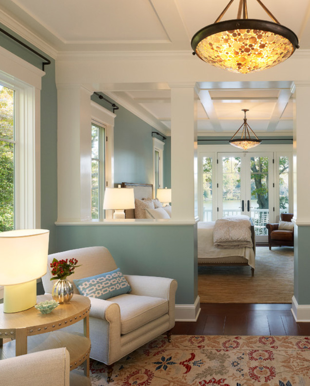
Aquamarine
Topping the trend is aquamarine. Shades of greens and blues have been proven to bring comfort and serenity to any space which is why this is a top choice. The depth of the color is sure to bring forth the feeling of peace and harmony. Designer Tip: This is a great color to use in guest rooms.
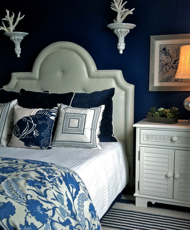
Classic Blue
Classic Blue is a color that can be used anytime and is always on trend because it truly is “classic”. It’s a high style color that creates a clear drama in any space.
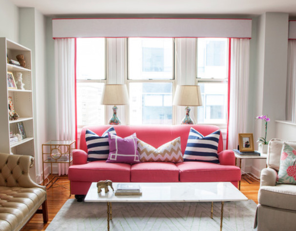
Strawberry Ice
Mouth watering Strawberry Ice brighten up a room with a shock of pink accent. The berry color is a perfect compliment other of the included colors, such as Toasted Almond or Titanium.
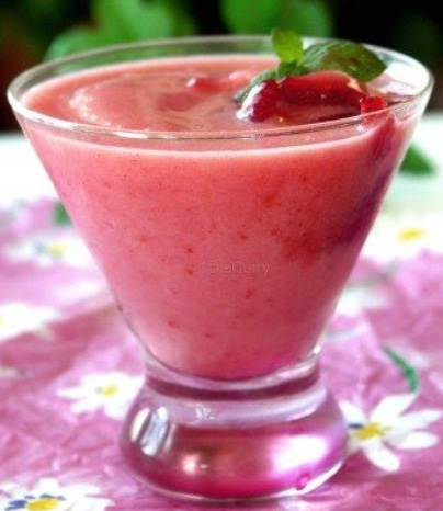
Toasted Almond
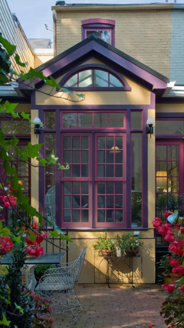
Toasted Almond is an anchor that will add a subtle background hue in any space. It is a very versatile color that will enhance other colors used with it.
Designer Tip: Try not to over use this color. There is a such thing as too much tan. Always add accent colors to liven up this subtle hue.
Marsala
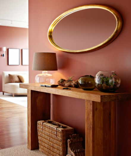
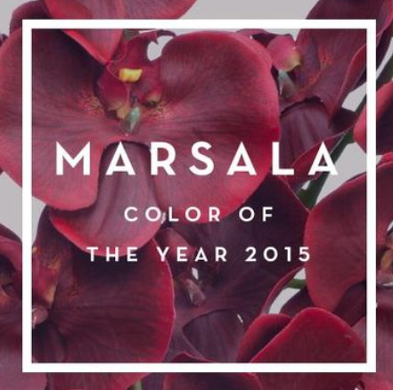
Marsala is the color of the year according to Pantone. I’ve heard mixed reviews about this color. Some people absolutely dislike it while others are ok with it. I haven’t met anyone that absolutely loves it. It’s a “safe” color that’s warm and rich.
Custard
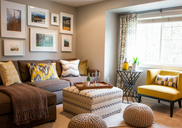
 Custard is vibrant color that will work great for accents. A comparable color to imagine could be Minion Yellow. Both colors are meant to make you feel happier and uplifted.
Some shades of green that seem to be a throwback to the 70’s are arising new stars. Woodbine Green and Lucite green are gaining in popularity. They sort of remind me of the avocado green that I’ve seen over the years in kitchens that I’ve remodeled. I think we’re ready for this color to come back, especially since it’s meant to brighten and lighten the mood. It’s definitely being used more successfully.
Deisgner Note: I personally tend not to use green in bathrooms and kitchens on large surfaces like the walls. The reflection off of the surface onto your face or onto food may give a pallid effect. Not good if you’re getting ready for a date.
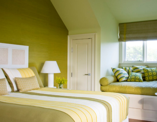
Woodbine
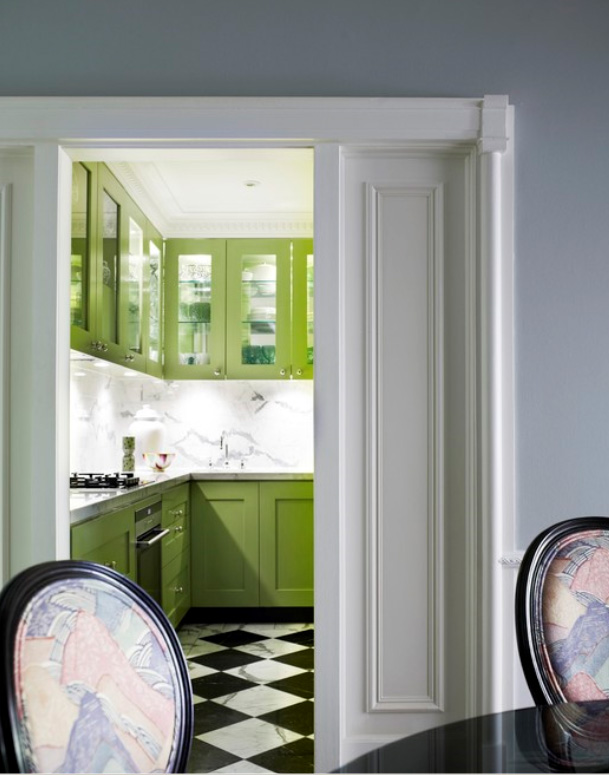
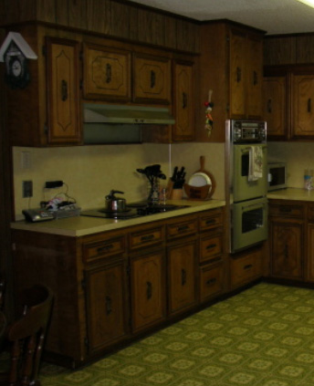 Memory of a sad + outdated kitchen:(
Tangerine was huge color from furniture market this past month. Hues of tangerine were found in every showroom on furniture, accessories and linens bringing a pop of excitement to market.
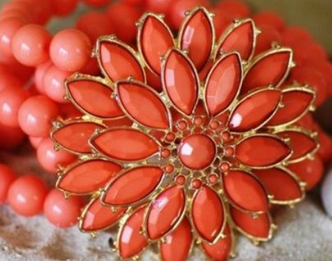
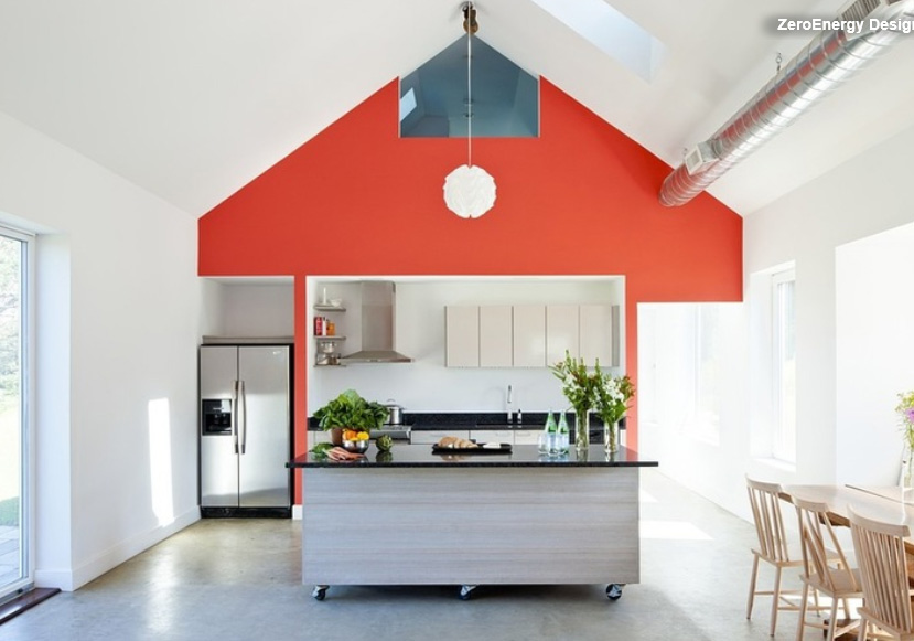
TANGARINE
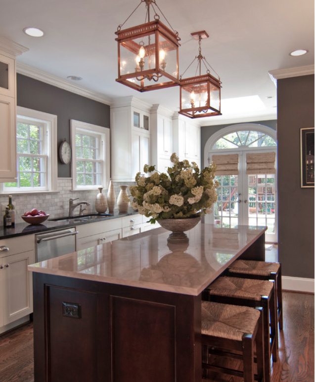
Titanium
A current trend is gray for all aspects of design. Pantone is calling it Titanium. It’s a warm shade of gray that will accompany any color in a dynamic way.
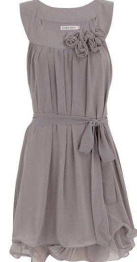
Finally, a great addition to the group is Lavender Herb. This is one of my personal big faves. I love the warm rich hues involved with this soft color. An asset to the color is that you can spill red wine on it and it wont show.
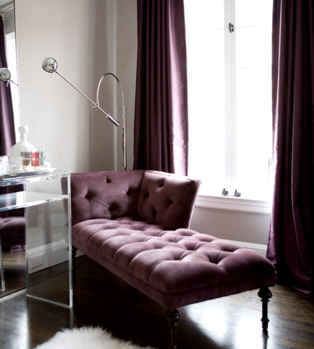
Lavender Herb
These fantastic new color choices that will hopefully liven up your spring and touch that creative element in your personality.
Most importantly – Have fun with them!
0 comment